Book Design
.webp)
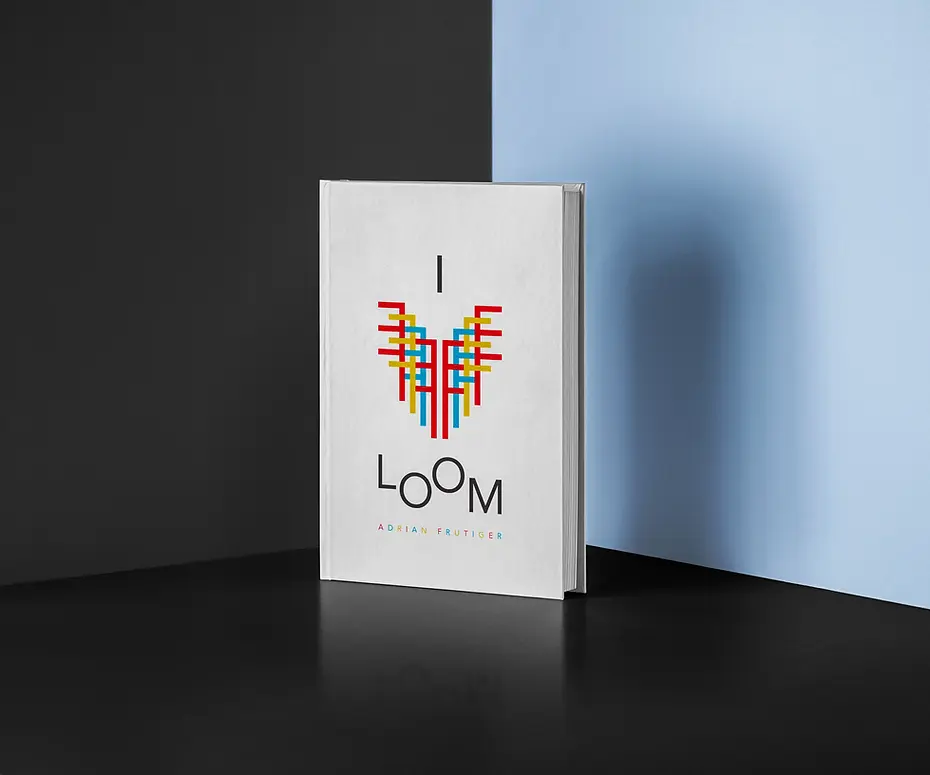
I Love Loom Book Design – Overview
This book design project, I Love Loom, was created during my early exploration of typography principles. Centered around Adrian Frutiger’s typeface Avenir, the design draws inspiration from Swiss art and the Jacquard Loom, one of Frutiger’s earliest influences. Using Adobe InDesign and bookmaking techniques I learned in undergrad, I developed both a softcover and a final hardcover version. The project emphasizes clean layout design rooted in typographic clarity, Swiss design, and visual rhythm.

Typography Exploration
I conducted a focused study on the Avenir type family, appreciating its clean, geometric form. I utilized styles like 55 Roman, 45 Book, and 65 Medium throughout the book. A standout detail I loved was the unique “Q” character, with its distinctive horizontal tail aligning with the baseline, one of the many thoughtful touches that influenced my design decisions.

Early Stages & Colophon Design
The design process began with rough sketches to establish layout and content structure. For the colophon page, I placed the final body text on the left side, scaled down to leave the opposite page intentionally blank. This minimalist, asymmetrical approach created a subtle and balanced closure, and ultimately set the tone for the visual style carried throughout the rest of the book.

Color Study & Design Refinement
While my initial designs featured a wide range of colors, a later color study led to a refined palette of red, yellow, blue, and black. This simplified scheme, rooted in Swiss design traditions, offered stronger visual cohesion with a touch of modern vibrancy.

Softcover Draft & Assembly
Before finalizing the colors & design, I also created a softcover draft to test the layout and overall feel. The assembly process involved careful folding, trimming, scoring, and gluing. The cover was printed on 60 lb. stock, with 32 lb. paper used for the interior pages, providing a clear sense of the book’s physical experience.


Final Hardcover Comparison
After reviewing a second softcover draft, I finally produced a professional hardcover copy. This version brought the entire project together, and I hope to one day offer it for sale. For now, feel free to download the digital version here.