SOCIAL CAMPAIGN Design

Feed To Succeed is a fictitious organization and social campaign design to promote food insecurity awareness in college campuses. The brand idea is that Feed To Succeed provides meals to students facing food insecurities in a college environment with an encouraging voice. Helping them feel relieved and confident while continuing their education.

When designing Feed To Succeed the first process was to establish a logo. So, I did a font study that reflects aspects of education and success.


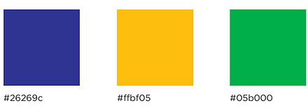
As my process continued there were many revisions of the typography of the logo. I finally settled for the Balboa Sans Serif font. From there I chose colors that represent education, success, and confidence. So I went with a simplified color scheme of blue, green, and yellow.
From my color palette I started to design icons, layout tests, and patterns. I decided to lean more towards the dot patterns and use rounded corners in some of my element designs.


From the dotted pattern, I added it to some promotional products I had sketched up. My idea was to have food related promotional items that were useful and unique.

I incorporated this dot pattern into my poster design as well.

Next I worked on social media promotion.
Finally I made a site layout for my campaign design. If you click the image on right you can see the full version.


